
The Internet is full of useless information, disguised in beautiful and pseudo-scientific visuals. Search for “infographics” on Pinterest and this becomes very apparent. It’s kind of sad, because succeeding in information visualization is not that hard. You’ll just need to keep a few things in mind. This article is a quick beginners primer to get started with the art of meaningful information design.
Content and goal
Your message needs to be relevant for the user or target group. Otherwise your commucation is wasted. So before you fire up Illustrator, devote some time answer these five questions:
- What are the real goals of the communication?
- What is the core insight you’re communicating
- Who are you communicating with?
- Why is your insight relevant to the target person or group?
- Where, when and how the communication occurs?
Pick the right tool
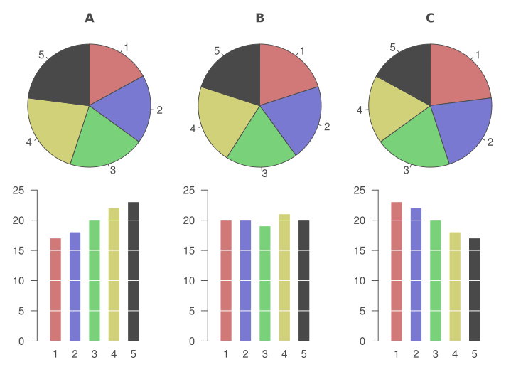
Bar chart is a stronger tool for comparison than pie chart. Our brains are more suited for comparing lenghts than areas.
Choose the tools and level of visuality to suit the context. If you want to provide accurate information, don’t push too much visual eye candy. If you’re designing an engaging ad, you’ll probably need some kick-ass graphics.
Tools for visualizations
 Bar chart, Histogram, Line chart

 Function graph, Area chart, Scatter plot

 Bubble chart, Cartogram, Flow chart

 Venn diagram, Pie chart, Radar chart

Gestalt principles
Gestalt psychology holds a set of descriptive principles about how we visually perceive objects. These principles are in action in nearly everything we do graphically as designers.
Similarity: Elements that share similar characteristics are perceived as more related than elements that don’t share those characteristics.
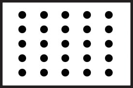
Proximity: Objects that are closer together are perceived as more related than objects that are further apart.
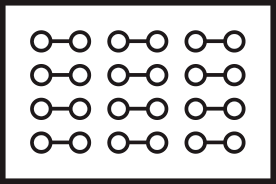
Connectedness: Elements that are visually connected are perceived as more related than elements with no connection.

Continuity: Elements arranged on a line or curve are perceived as more related than elements not on the line or curve.
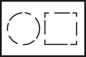
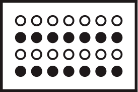
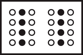
Closure: When looking at a complex arrangement of individual elements, humans tend to first look for a single, recognizable pattern.
Common fate: Elements that move in the same direction are perceived as more related than elements that are stationary or that move in different directions.

Symmetry: People tend to perceive objects as symmetrical shapes that form around their center.
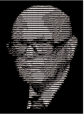
Good shape: People will perceive and interpret ambiguous or complex images as the simplest form(s) possible.
10 tips for better visualisations
- Decide what, why and to whom you want to communicate
- Learn what went wrong with failed visualizations
- Study the basics of visual design: composition, typography and color
- Remember the principles of Gestalt psychology
- Don’t use graphic design for pointless eye candy
- One or two different fonts are usually enough
- Use colors purposefully
- Exaggerated use of saturation hurts eyes
- Try to fit the visualisation in one view
- Bar charts eat pie charts for breakfast
Less is more
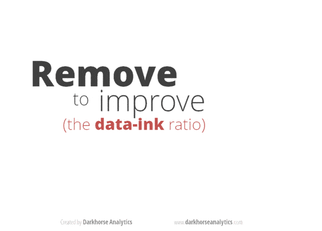
© Darkhorse Analytics
Further reading
Information visualization fails
- Guardian: 16 useless infographics
- Business Insider: 11 Reasons Infographics Are Poison
- Information Aesthetics: Most Ugly & Useless Infographic Winners
On the web
- 7 Rules for Creating Gorgeous UI: Part 1, Part 2
- Steven Bradley: Design Principles: Visual Perception And The Principles Of Gestalt
- Colin Ware: Representing Data using Static and Moving Patterns
- Visyal.ly: Works of Accurat
- Transport for London: A History of the London Tube Map
- Stephen Few: Why Most Dashboards Fail
- Stephen Few: Show Me the Numbers
- Wikipedia: Gestalt psychology
- Graphic design basics: composition, typography ja color theory
Blogs
- Alberto Cairo: The Functional Art
- Nicholas Felton: Feltron
- Density Design
- Nathan Yau: Flowing Data
- Hilary Sargent: ChartGirl
- Kaiser Fung: Junk Charts
Books
- Edward Tufte: Envisioning Information
- Edward Tufte: The Visual Display of Quantitative Information
- Colin Ware: Visual Thinking for Design
- Jacques Bertin: Semiology of Graphics
- Alberto Cairo: The Functional Art
- Stephen Few: Information Dashboard Design
- John Maeda: The Laws of Simplicity
- Don Norman: The Design of Everyday Things
Software
Thank you for your ideas: Hannu Oksa, Johan Himberg, Esa Hallanoro, Mathias Lindholm, Mikko Romppainen, Tuomas Husu, Oskar Ojala and Karri-Pekka Laakso.


